How To Configure Image Card - PRO Field
What is an Image Card Field?
The Image Card field lets you create visually engaging questions where your users select from options displayed as images. Instead of choosing from text alone, users see images with labels and descriptions, making it perfect for product selection, design choices, preferences, and more.
Think of it like a visual multiple-choice question, great for making your calculator more interactive and user-friendly.
When to Use Image Cards
- Product Selection: Let users choose between different products or pricing tiers with product images
- Style/Design Preferences: Show visual styles, colors, designs, or layouts for selection
- Feature Bundles: Display different package options with images and descriptions
- Visual Assessments: Create image-based quizzes or preference surveys
- Multi-Option Selections: Any scenario where images help users understand their choices better
Adding an Image Card Field
- In the calculator builder, click the + Add button to add a new field
- Select Image Card from the available field types
- Your new Image Card field appears on the canvas
Configuring Your Image Card
Once you've added an Image Card, click on it to open the settings panel on the right sidebar where you can configure:
Basic Settings
- Label: Give your field a clear name (e.g., "Choose Your Plan")
- Description: Add helper text below the label if needed
- Tooltip: Optional text that appears when users hover over the field label
- Sub-description: Additional text displayed under the main label
Adding Options
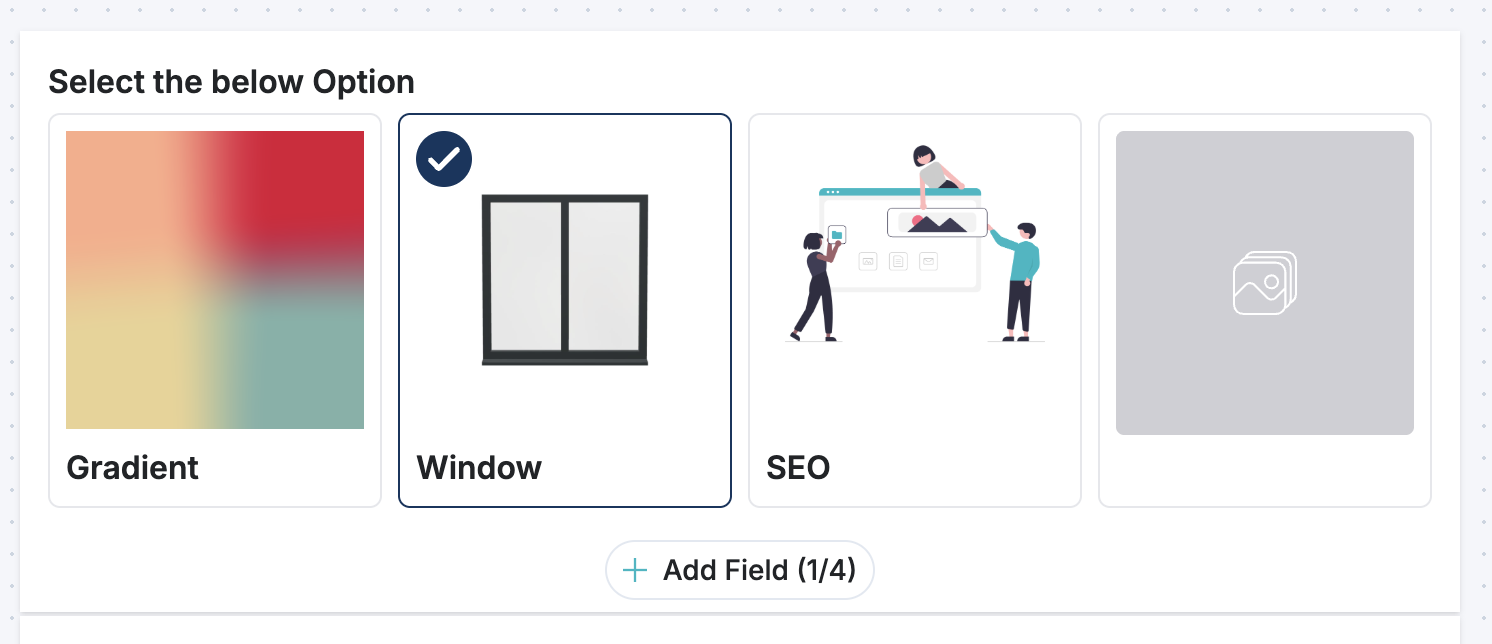
- Click "Set Options" to expand the options section
- Click the "+ Add" button to add a new option
- For each option, you can configure:
- Name: The text displayed below the image (e.g., "Basic Plan")
- Sub-description: Optional text below the name (e.g., "Perfect for beginners")
- Image: Upload an image for this option
- Value: A numeric value used for calculations (e.g., price of $29 = value "29")
Make sure each option has a clear name and distinct image so users can easily understand their choices.
Selection Mode
Choose how users can select options:
- Single Selection (default): Users can select only ONE option at a time—like answering "Which plan do you prefer?"
- Multi-select: Toggle the Multiselect switch to allow users to select MULTIPLE options—useful for "Select all features you want"
Field Requirements
- Make it Required: Toggle Required if users must make a selection before submitting
- Error Message: If required, enter a custom error message (e.g., "Please select a plan to continue")
Styling Options
-
Check Position: Choose where the checkmark appears on selected cards
- Left: Checkmark in the top-left corner
- Right: Checkmark in the top-right corner
-
Cards Per Row: Adjust how many image cards display per row (1-6)
- Fewer cards per row = larger cards
- More cards per row = smaller cards
Consider your images and screen sizes—test on mobile to ensure cards aren't too small
How It Works
- Single-select mode: When a user clicks an option, any previously selected option is deselected
- Multi-select mode: Users can click multiple options—each acts independently like a checkbox
- Value calculation: The field automatically adds up the values of all selected options
- Example: If users select options worth $29 and $50, the field value becomes $79
- This value can be used in formulas or shown in results
Best Practices
- Use Clear Images: Choose distinct images that clearly represent each option
- Add Descriptions: Use the sub-description field to provide context about each option
- Limit Options: Too many options can overwhelm users—keep it to 3-6 for best experience
- Test Responsiveness: Preview your calculator on different screen sizes to ensure cards display well
- Match Your Brand: Use images consistent with your brand or calculator theme
- Simple Labels: Keep option names short and scannable (2-4 words ideal)
- Value Assignments: For product selection, use actual prices or quantities as values so calculations work correctly
Example Use Cases
Product Selection Calculator
- Create options for different product packages
- Upload product images
- Set value to product price
- Users select their preferred product
- Calculator shows total cost
Style Preference Selector
- Show 4-6 different design options
- Add descriptions like "Modern & Minimal" or "Vibrant & Bold"
- Set values for scoring if this feeds into recommendations
- Allow single selection for a style recommendation
Feature Bundle Selector
- Display different feature tiers
- Upload images representing feature levels
- Enable multi-select so users can customize features
- Aggregate selected values for total cost
Troubleshooting
Images not showing?
- Make sure images are uploaded correctly in the image field
- Check that the image file format is supported (JPG, PNG, etc.)
Cards too small or too large?
- Adjust the "Cards Per Row" slider to get the desired size
- Fewer cards per row = bigger cards
Users can't select?
- Make sure you've added at least one option
- Check that options are properly configured with a name and image
- Verify you're in the correct selection mode (Single vs. Multi-select)
Value not calculating correctly?
- Ensure each option has a numeric value assigned
- Check that you've set values as numbers (e.g., "29" not "$29")
- Values are added together—make sure that's the behavior you want
Tips for Mobile
Image cards work great on mobile, but keep these tips in mind:
- Use 1-2 cards per row on mobile for larger, tappable cards
- Keep option names concise so text wraps properly
- Test on actual mobile devices or use the preview feature
- Larger images are generally better for touch interfaces