What Is Numeric Input Component? #
The numeric input field is a free number entry field to type any number. Let’s take a look at all the available options you can use to configure it.

Configuration Options #
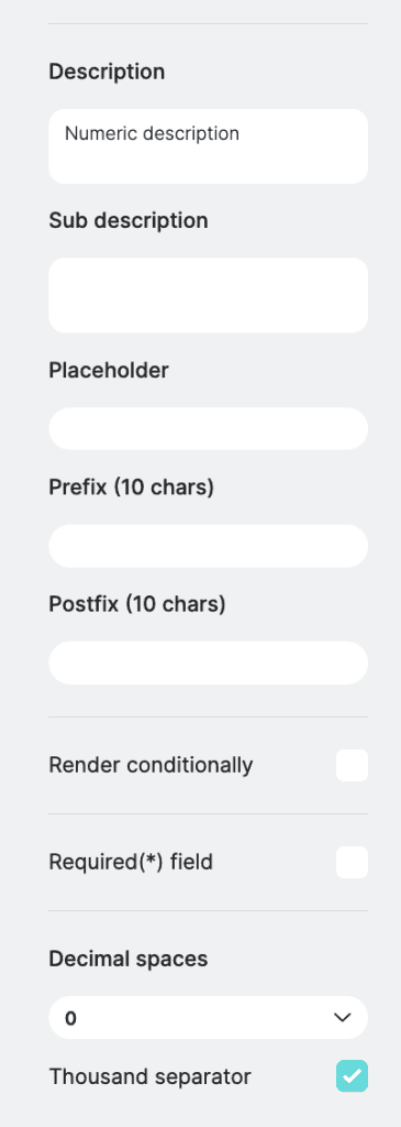
Description & Subdescription #
Input a description for the numeric input field. Provide additional context or instructions regarding the purpose of the numeric input field.
Subdescription allows you to provide further details or clarification for end users.
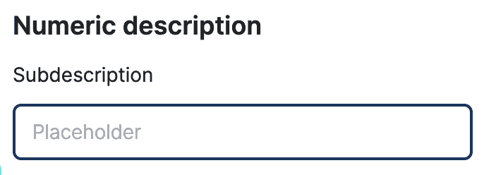
Placeholder #
Display temporary text within the input field to guide users on the expected input format.

Prefix and Postfix #
Add text before and after the numeric input field value to provide more context or units. Note that text is displayed within the input field box and both prefix and postfix are limited to 10 characters.

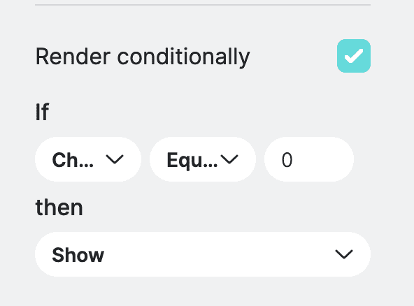
Conditional Rendering Settings – PRO Feature #
Determines whether the numeric input should be displayed or hidden based on certain conditions. This is typically useful when you want to display field based on another field or result value. You can define the conditional settings by selecting a field from available list, then you need to select the operation, more, less, equals and finally value. Once you define the condition, then you can choose to either show or hide the current field.
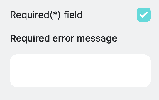
Required Field #
Allows you to mark numeric input as required. When marked field as required user needs to fill it out before otherwise they will not be able to submit the form. You can also define an error message that will be displayed if field validation fails.
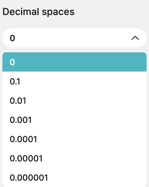
Decimal Spaces #
Determines the precision of numeric values entered into the input field. The maximum precision is 6 digits.
Thousand separator #
Enhances readability by separating groups of digits with commas.
