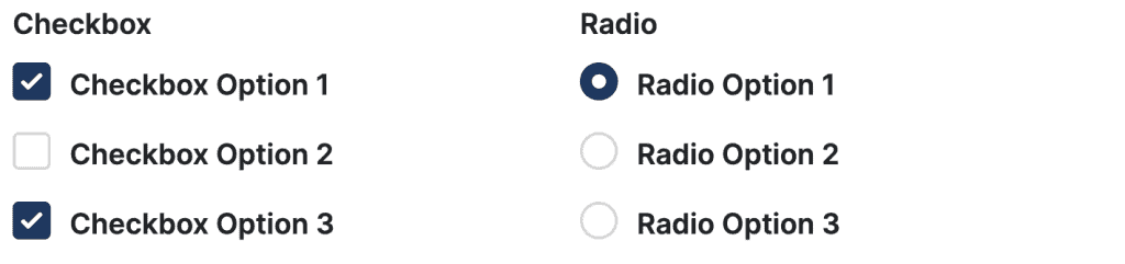
What Are Checkbox And Radio Components? #
Checkbox and radio components are essential elements of interactive forms, offering your users the ability to make selections from predefined options.
What is the difference between checkbox and radio?
Checkboxes allow users to select multiple options simultaneously, whereas radio buttons enable users to choose only one option from a set of alternatives.
Config Options #
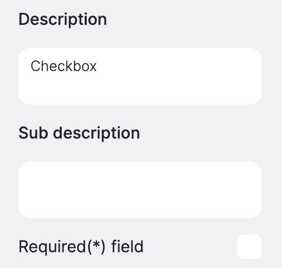
Description and subdescription #
Define the description and sub description of the checkbox and radio. You can also mark the field as required, to enforce users to select the option before submitting the field.
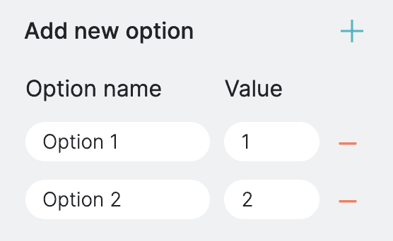
Options Configuration #
Allows you to define the options available for selection. To add a new option you can use the + (plus) button next to the Add new option label. The option has two values
- Option name – the user readable option name.
- Value – numeric representation of the option that will be used in your calculations.
The minus sign next to the option removes given option.
Important note: When using checkboxes allowing multiple selections, the field’s value in the formula is determined by summing the values of the selected options. For instance, if a user selects Option 1 and Option 2, each with values of 1 and 2 respectively, the total value used in the calculation will be 3.
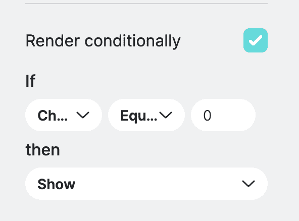
Conditional Render – PRO Feature #
Determines whether the component should be displayed or hidden based on certain condition of other fields. This is typically useful when you want to display field based on another field value. You can define the conditional settings by selecting a field from available list, then you need to select the operation, more, less, equals and finally value. Once you define the condition, then you can choose to either show or hide the current field.
Field Orientation #
Allows you to specify the orientation of the checkbox or radio button options. We recommend using vertical orientation when you have lots of options to select from.

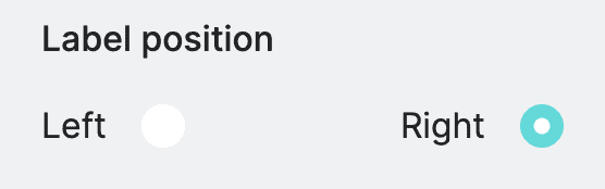
Label Position #
Allows you to specify the position of the labels relative to the checkboxes or radio buttons.